MSP
Corporate Investing
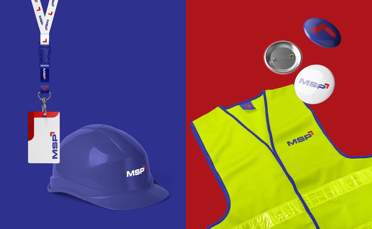
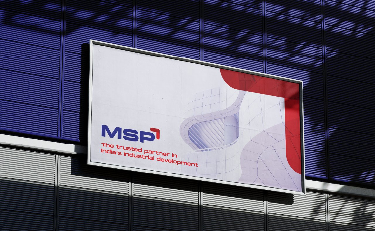
Most corporate clients want to convey strength, endurance, and maturity. The brief for this logo project came with the colour restriction of blue and red.
A stark serif font complies with the need to convey their gravitas. This striking wordmark is balanced with an iconic yet modern arrowhead that simply and effectively denotes upward growth in the market.
Designed 2021


